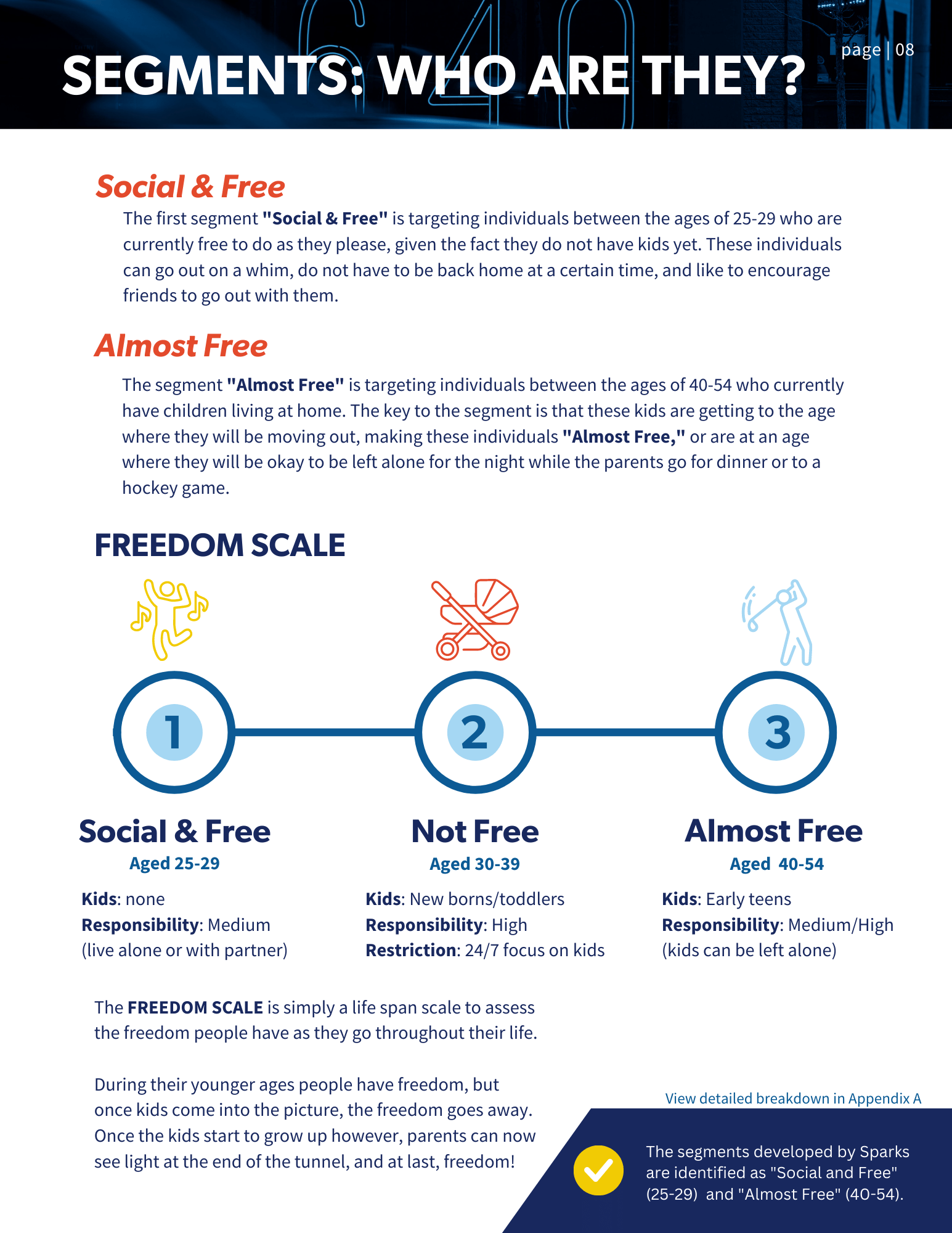
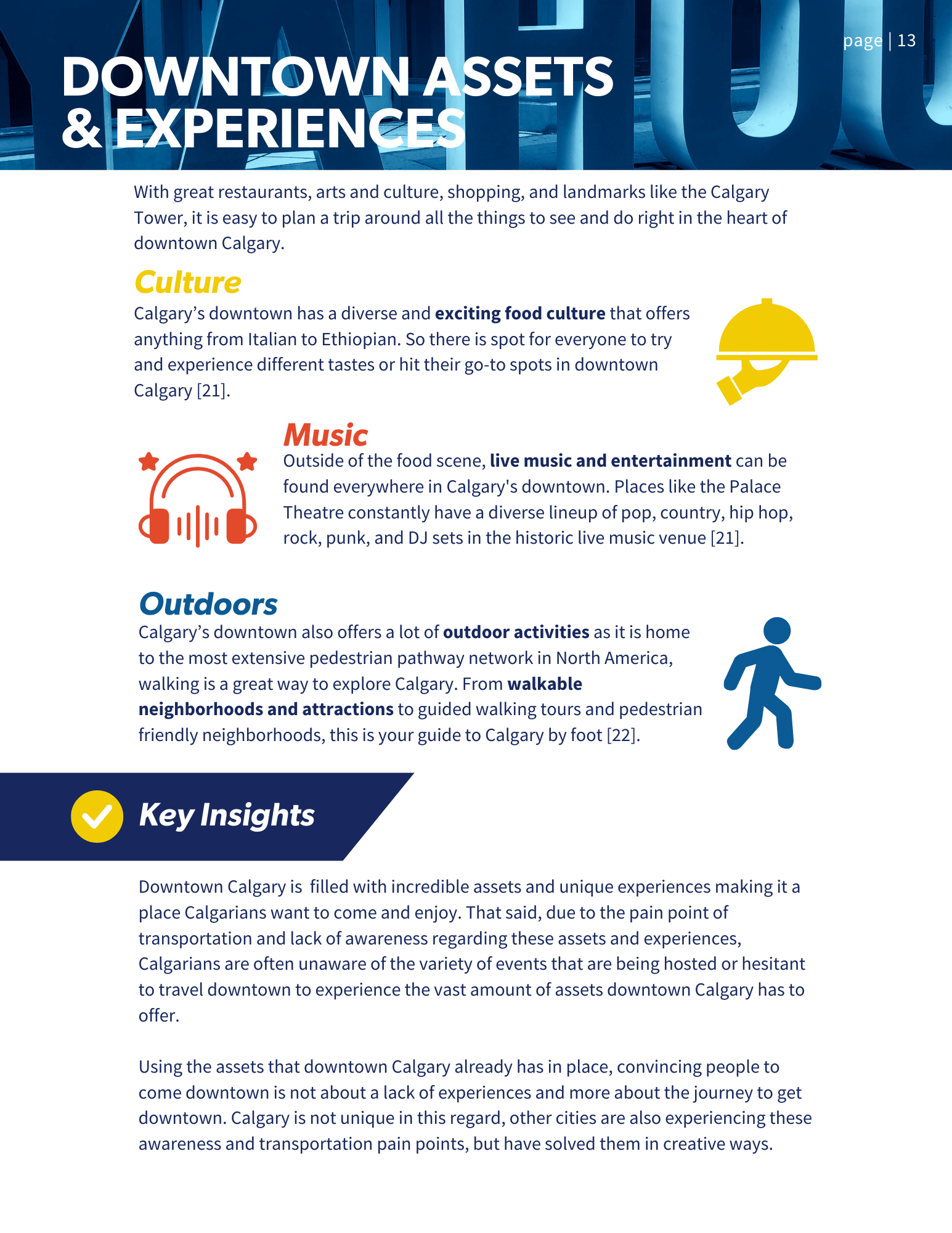
Project Overview
This project was a wild ride of design work, teamwork, research, and creativity. Our challenge was to increase foottraffick in downtown Calgary, so I wanted our report's design to reflect that. Throughout this project I worked on multiple design elements including maps, an app UI mockup, and the layout and design for the report.
The Client
The Calgary Downtown Association is a collection of businesses, organizations, and residents who work together to create a vibrant downtown experience. Calgary Downtown Association stands to advocate and deliver on the Greater Downtown Plan. The aim through this initiative is to execute a plan to get more people to come into downtown, to enjoy the amenities, activities, shops, restaurants, and much more!
The Team
Sadhvi Bhanot: Design, Research, and Strategy
Tegan Gislason: Chief Strategy Officer
Alexandra Kravec: Research and Strategy
Brooke Macklin: Research and Strategy
Eric Pryor: Research and Strategy
Dan Roman: Research and Strategy
Sarah Thomson: Design Director, Research, and Strategy
Jayman Wollen: Research and Strategy

Report Layout
I used rounded edges and vibrant colors to create visual hierarchy and flow, ensuring each page engaged readers without overwhelming them. I also edited images of downtown Calgary with a cool blue hue to keep a balanced color scheme throughout.


Maps
The maps posed a unique challenge due to data discrepancies between community data and census tracts. I resolved this by creating a combined design that effectively analyzed the data we had collected.
Below are examples of each map and how I combined them.

Calgary's communities (left), the Calgary census tracts (right)
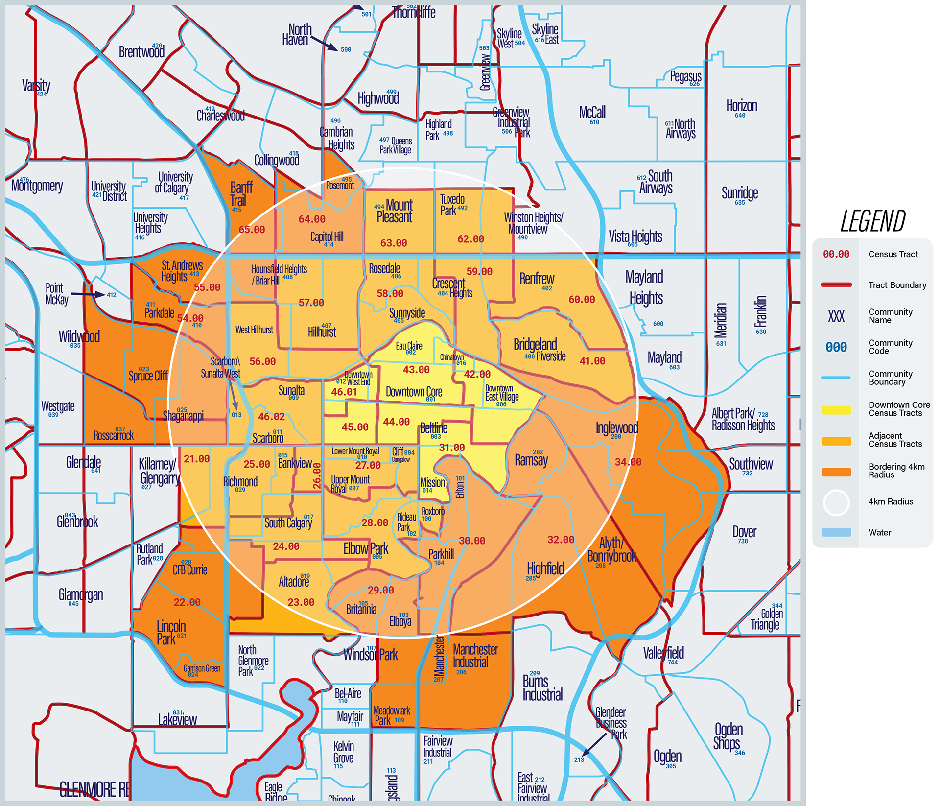
A simplified, combined version
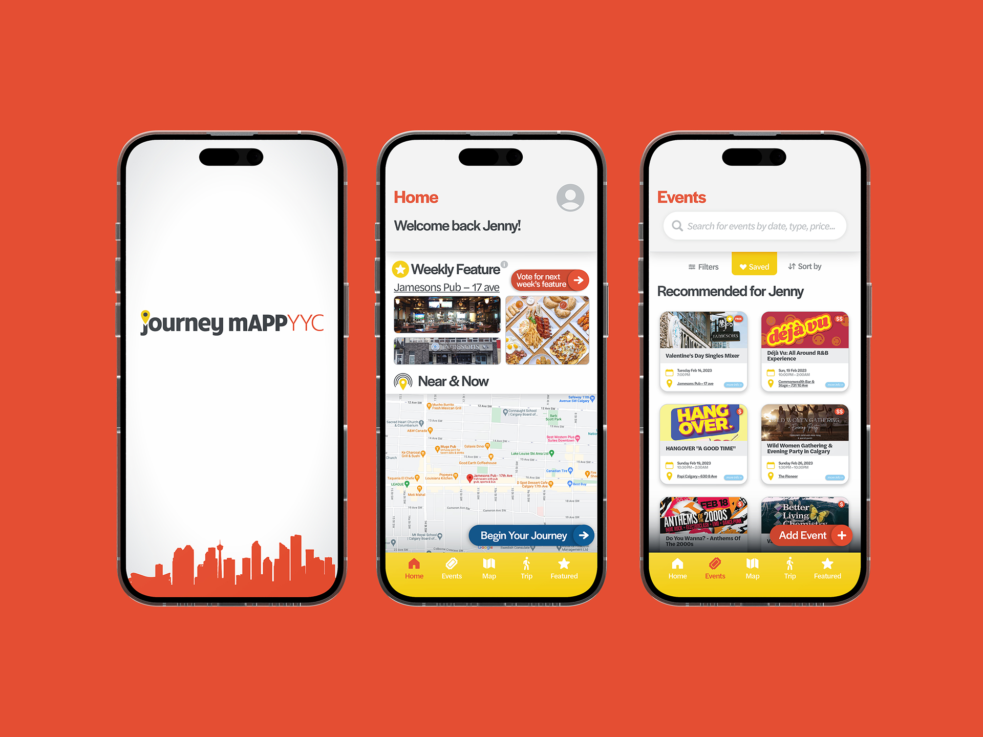
JourneyMAPP
We pitched “JourneyMAPP” as a user-friendly app that combines tools like transit schedules, Eventbrite, Ticketmaster, and Yelp, all incentivized with deals to “simplify the journey.” I researched similar apps to develop the mockup, ultimately using Sparks' color palette and an intuitive UI design that emphasized user-friendliness.


The Outcome
I’m thrilled with the final report, which bursts with energy and personality, making it a truly engaging read. While there were minor aspects I could have refined, the final product was a success I’m proud of. This project helped advance my design skills in areas like visual hierarchy and consistency in branding
Reflection
Through this project I got to do so many things I haven't even mentioned like sifting through raw data and digging deep into my research. It was a great learning experience, especially in simplifying the mountain of complex information and making it visually appealing. My biggest takeaway? Design is all about making connections—between the data, the user, and the story.