Project Overview
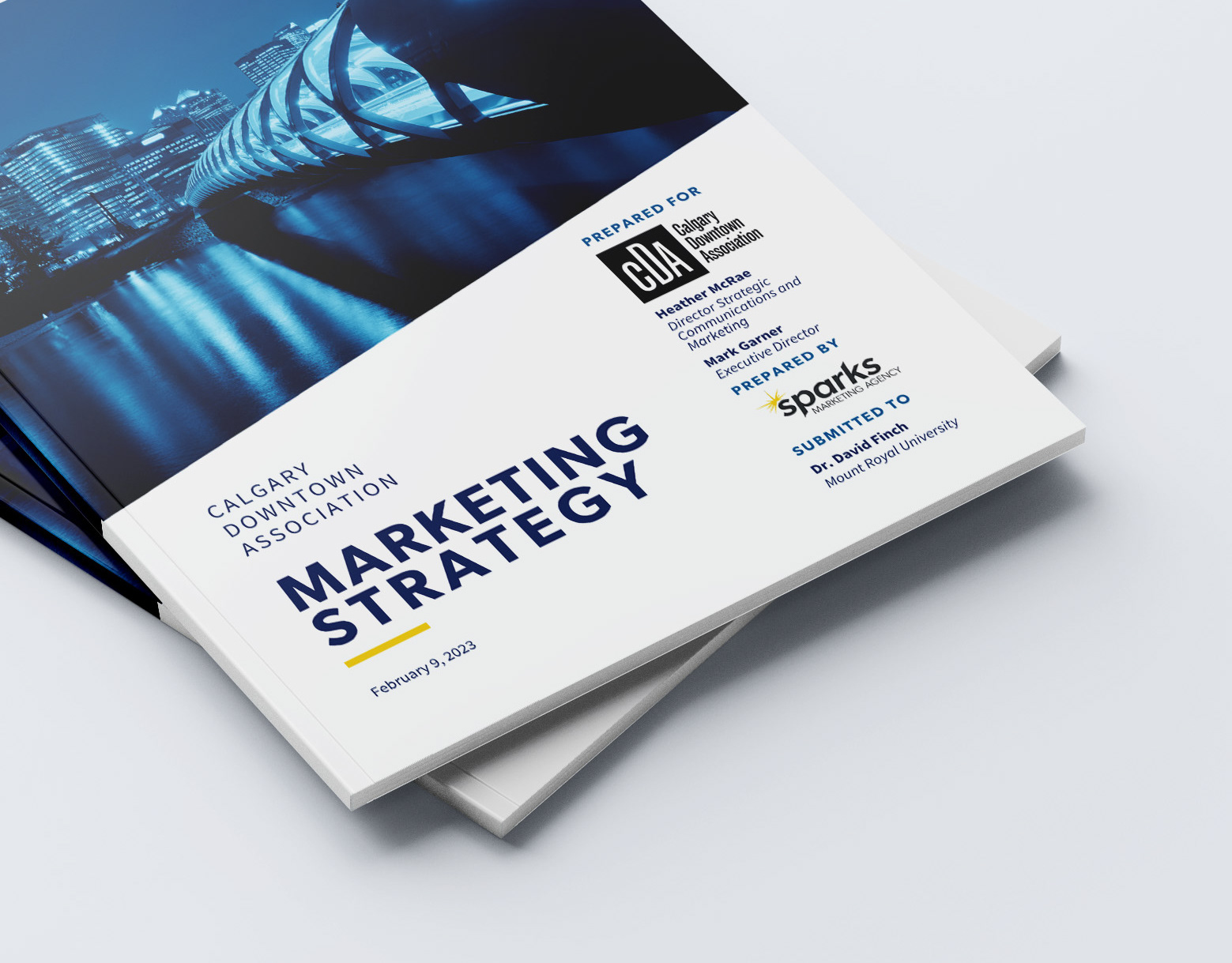
Sparks was an agency of nine people developed for a capstone course at Mount Royal University. We dove deep into market research and pitched creative marketing strategies for Suncor Energy and the Calgary Downtown Association.
The experience challenged me to think outside the box and gave me a taste of what it's like to work collaboratively on high-stakes projects.
My Role
I was thrilled to take on the role of Art Director and create a visual identity that truly represented our team's electric energy. I poured my creativity into every aspect of the project, from designing the agency's visual identity to the design of each report. It was a fantastic experience to put my design skills to the test and work with a team of talented marketers to create something extraordinary.

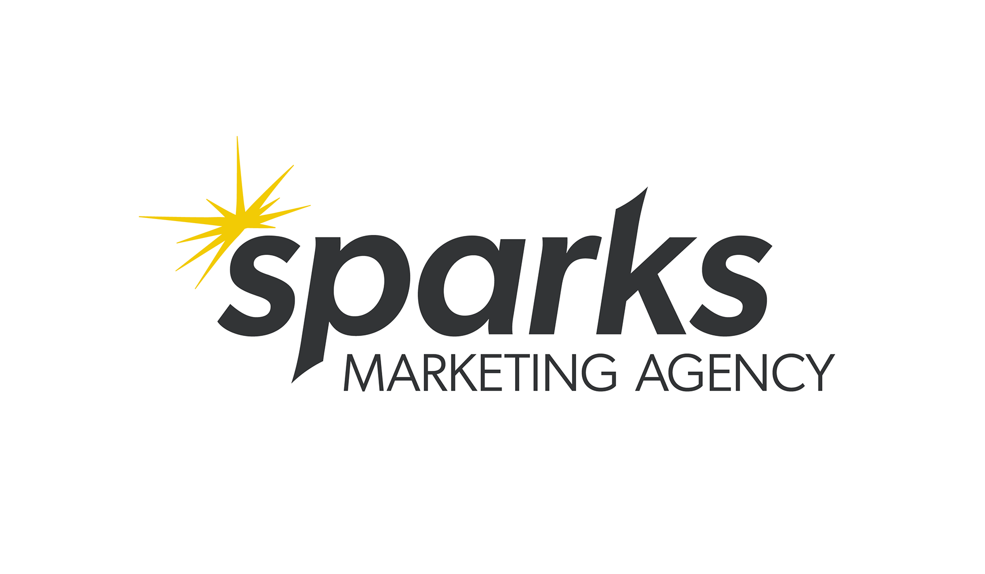
Branding
For the logo, I wanted something that would catch the eye and convey our dynamic approach to problem-solving. I decided to incorporate a spark above the logotype, which gave it a little extra spark of personality! To keep things balanced, I opted for Gibson Semibold Italic with a lowercase 's.'
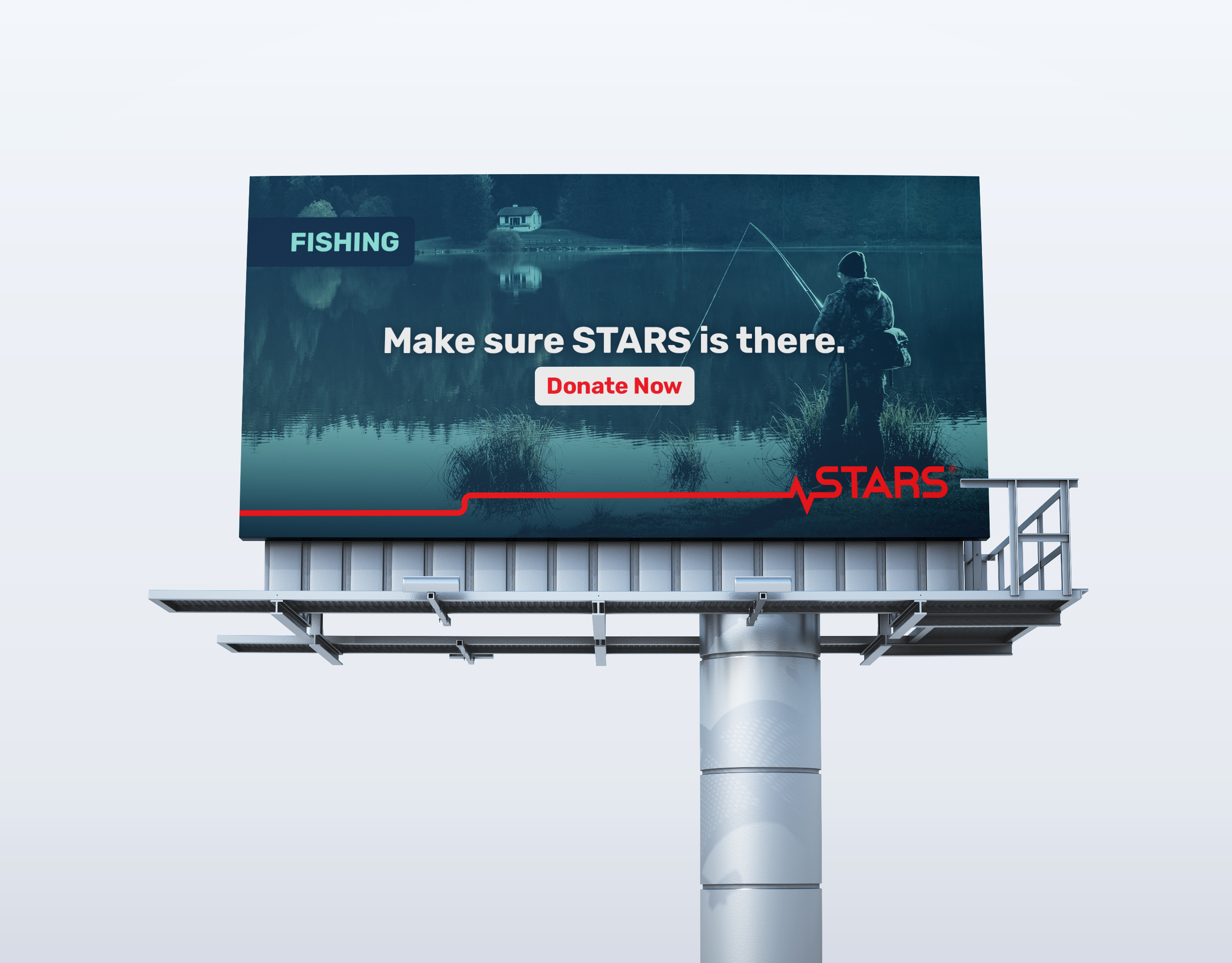
As for the colour palette, I knew we needed to convey both friendliness and credibility. That's why I chose a few blues to create a sense of comfort, an accent yellow to add a pop of warmth, and a bold accent red to highlight important information. Overall, I couldn't be happier with how the visual identity turned out!