It's Friday night at the client party.
The team just crushed a round of drinks.
Someone spilled their drink on a potential supplier. Someone else shared a little too much. Another is asleep in the corner.
You? You stole the show.
They got too loose.
You chose Loose Goose.
Role
Brand strategy, visual identity design, and packaging concept for a non-alcoholic brewery, including logo design, brand colours, typography, and packaging.
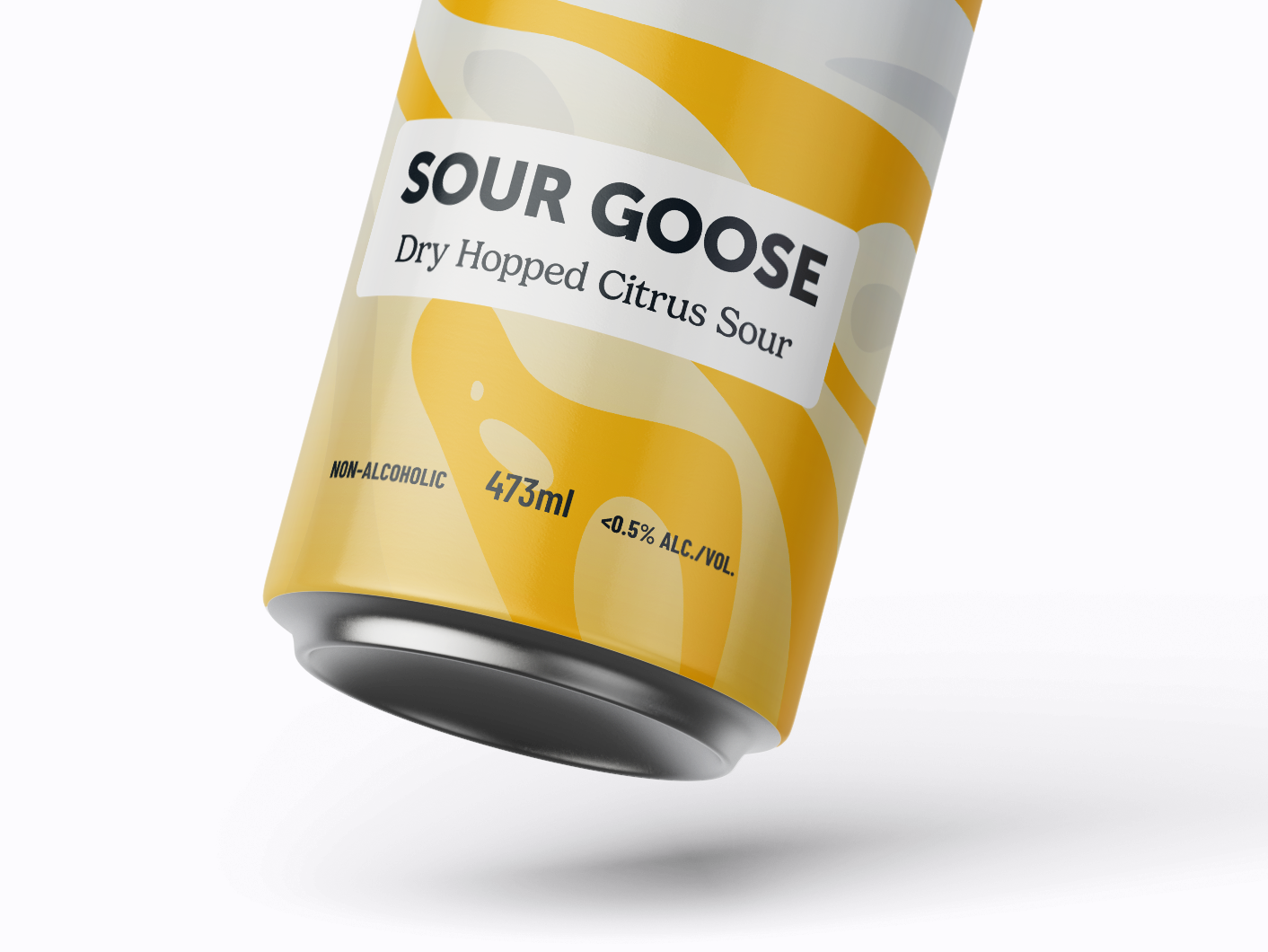
The name of the beer in bold, sans serif type. Paired nicely with a friendly serif.
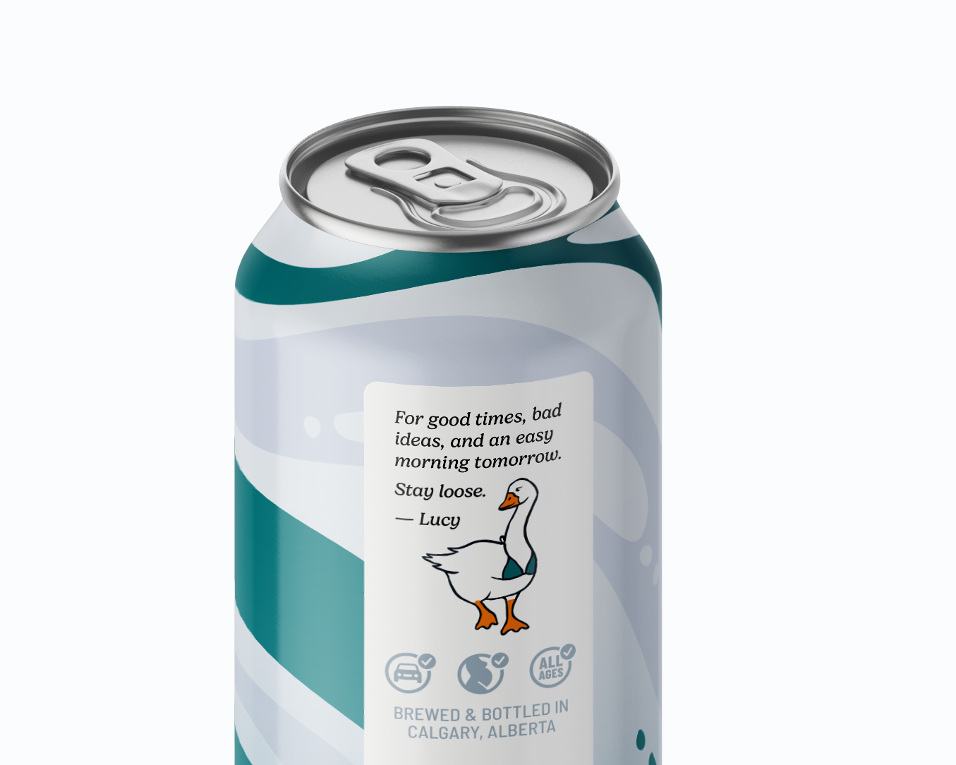
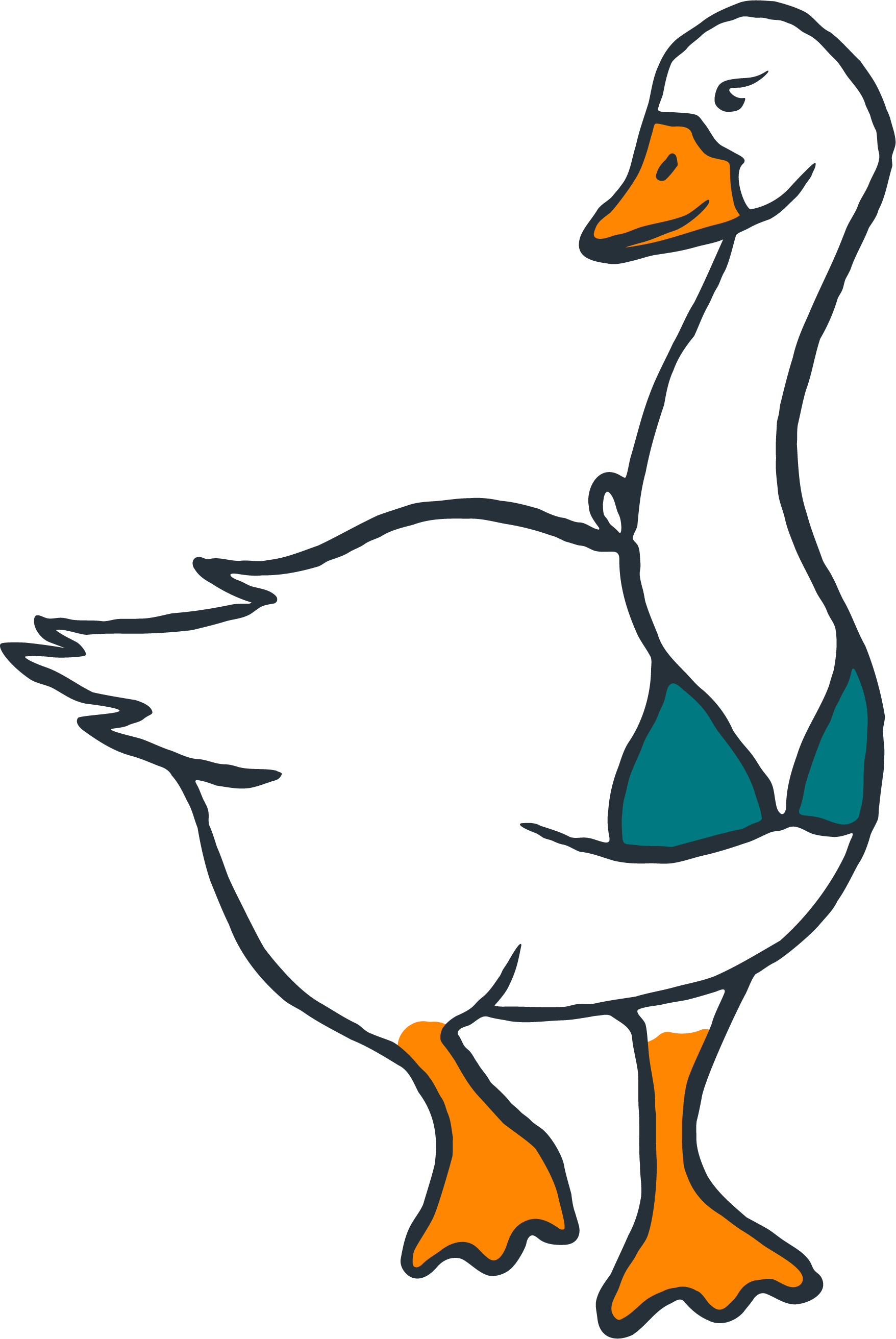
A message from Lucy the goose on the side of the can.
Outcome
A unique brand identity that stands out in the non-alcoholic beverage space. Unlike most non-alcoholic beers, Loose Goose veers away from health and wellness, and focuses on the social implications of a good NA beer.
The packaging illustrates movement and flow. The bright colours go well with the off-white pattern, and catches the eye without overwhelming it.
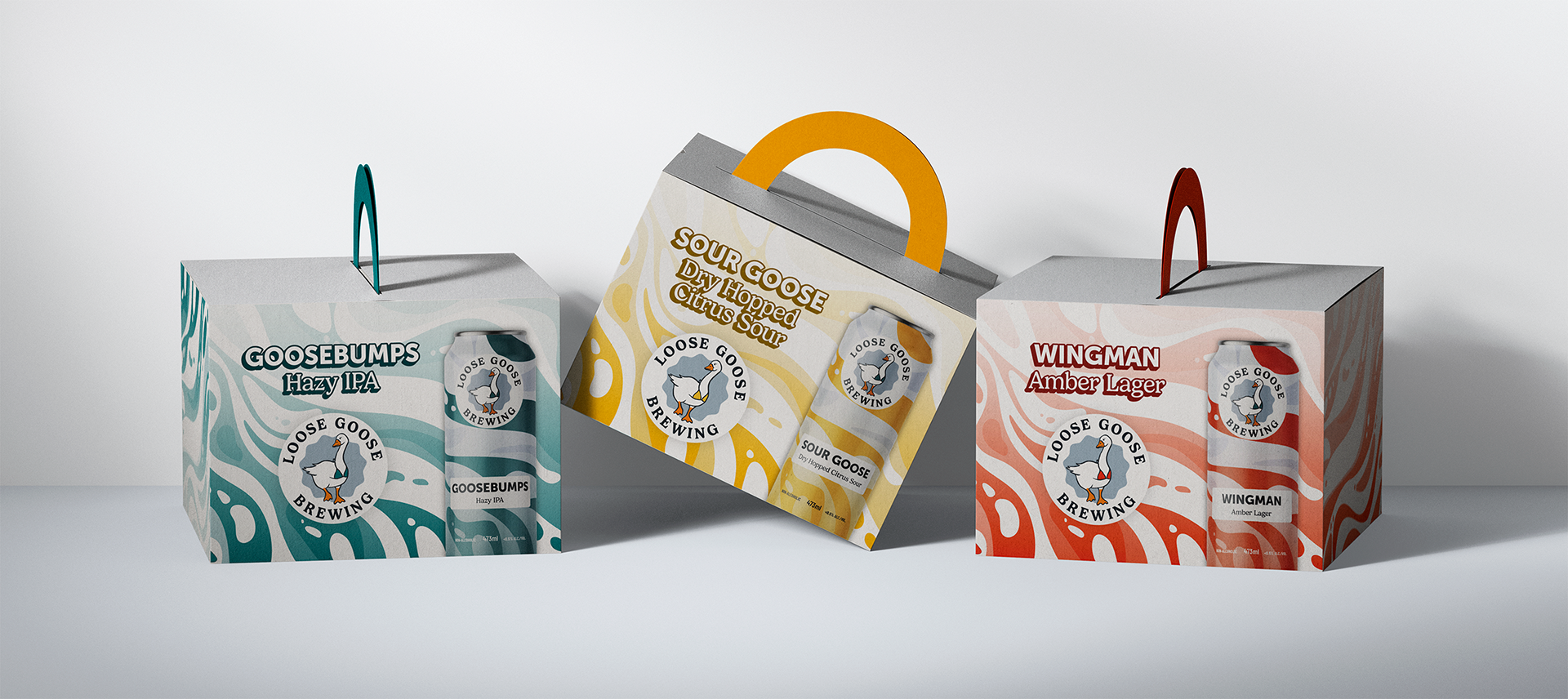
Contained geese, prior to being set loose.
Insights
The concept challenges the perception that non-alcoholic beer must feel clinical, desaturated, or over-styled.
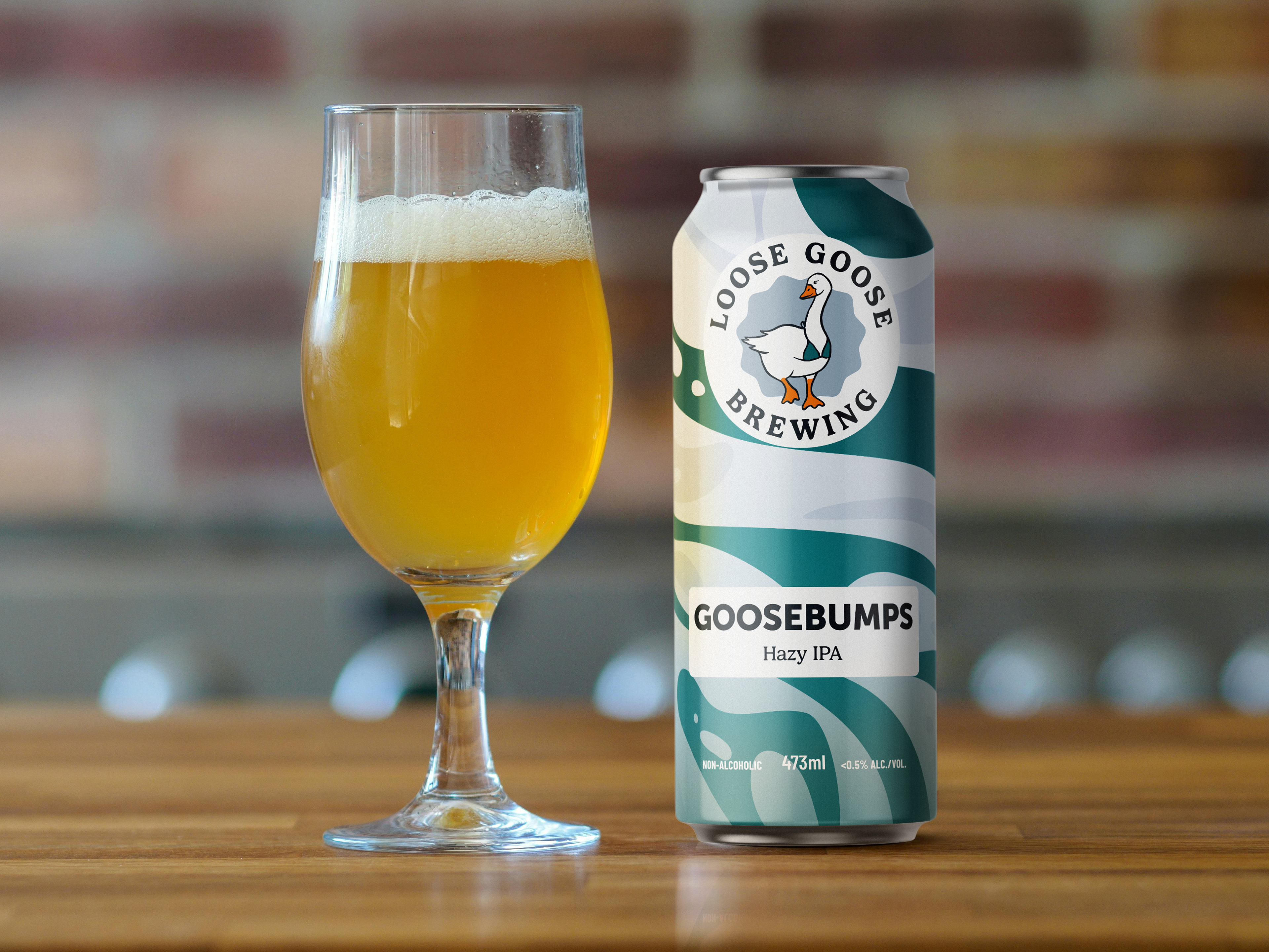
Goosebumps, the Hazy IPA featured next to the
Process
Illustrating Lucy (the goose) was difficult. First, geese can be a bit finicky to draw with their proportions. Second, there are zero pictures of a goose wearing a bikini to reference, and AI is spectacularly unhelpful.
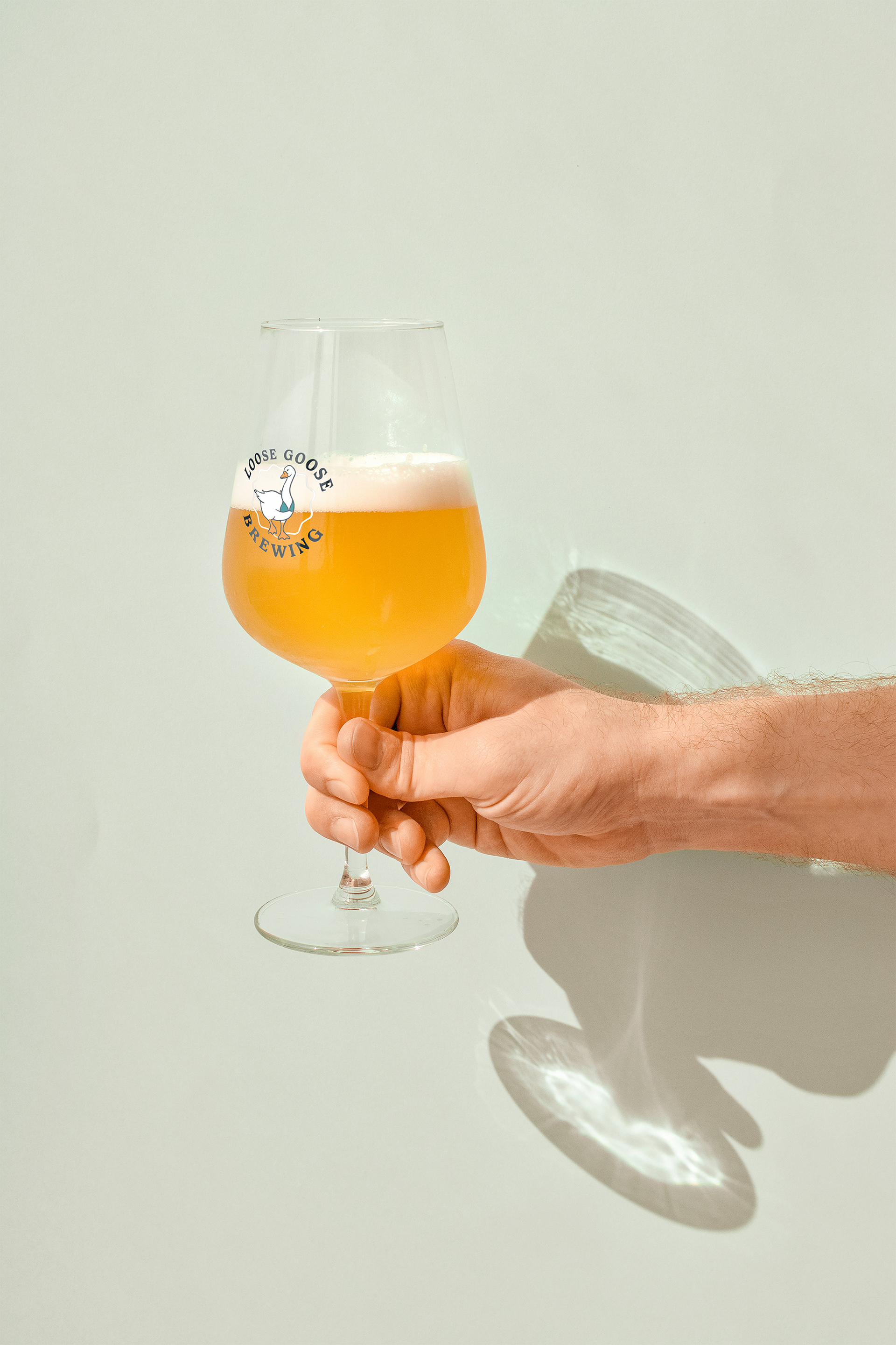
Mockup of a glass with the Loose Goose logo.
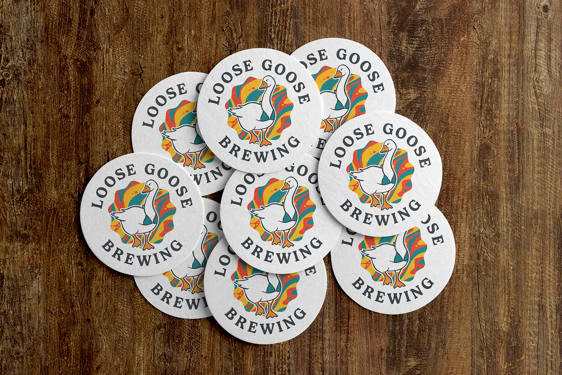
Coasters for promotion
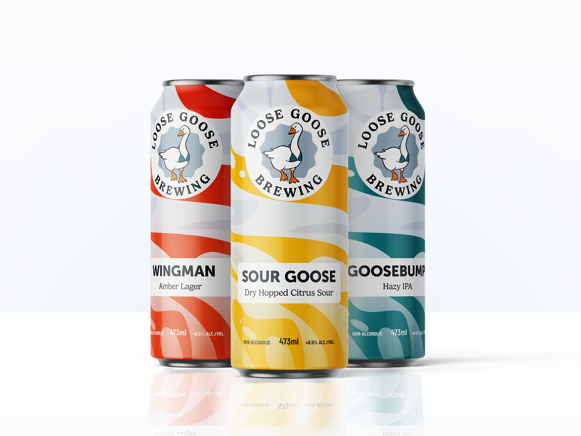
The Loose Goose Flight